
Every Time This Has Happened Since 1978, the Recession Was Already Starting
Chart of the Week #100

This is our 100th Chart of the Week. For the milestone, I wanted to pick something worth keeping in the back of your mind through the rest of the year.
The chart below is the 10-year Treasury yield minus the 2-year Treasury yield — the “2s10s spread” for short. It’s probably the most reliable recession indicator in American finance. The Fed watches it. Bond desks watch it. And since the late 1970s, it has never been wrong about a recession, with one brief exception I’ll come to in a minute.
Here’s how to read it.
Long-dated bonds normally pay more than short-dated ones — investors want extra yield for locking their money up longer. On the chart, that shows up as the line sitting above zero. Every so often, though, that relationship flips. Short-term yields climb higher than long-term ones, the line crosses below zero, and what you’ve got is called an inversion (whether that’s driven by the Fed pushing short rates up, the market pulling long rates down on weaker growth expectations, or both). In plain English, an inverted curve is the bond market telling you lower rates are coming — which, historically, only happens when the economy is headed for real trouble.
That’s the part most market-watchers at least vaguely know. But here’s the part they miss.
The inversion itself isn’t the recession signal. The un-inversion is — the moment the curve crosses back above zero after months or years of the opposite. And every single time that has happened since 1978, with that one 1998 exception, a U.S. recession was either already underway or starting within six months.
Take a look.
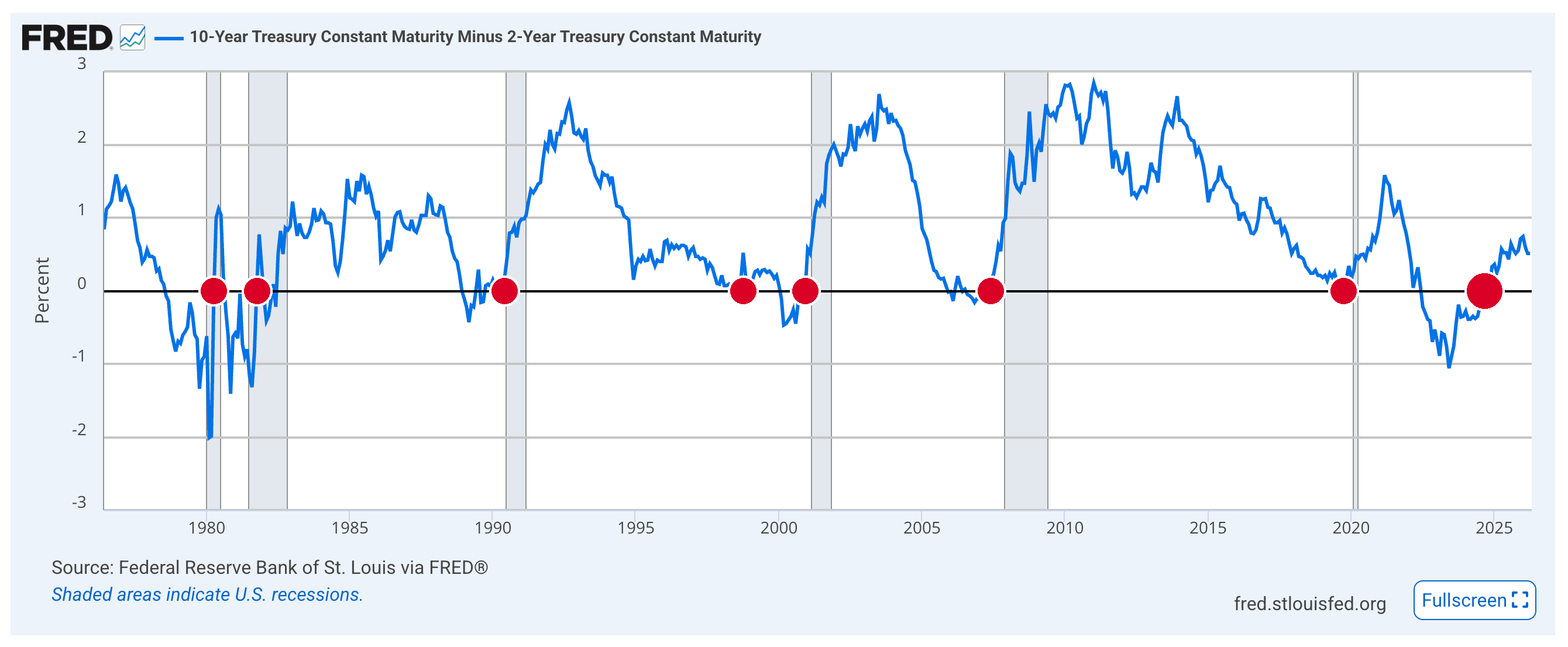
The blue line is the 2s10s spread I just walked you through. The grey vertical bars are NBER-dated recessions.
Note: NBER — the National Bureau of Economic Research — is the official body that dates American recessions. They’re the ones who decide, usually six to twelve months after the fact, whether we were in one.
For your convenience, I’ve marked each un-inversion on the chart with a red dot — eight of them, spanning fifty years. Six of them either sit inside a grey recession bar, or right up against one.
Let me walk through them:
1980 recession. Un-inversion April 1980. The recession had already started in January.
1981–82 recession. Un-inversion October 1981. Recession started that July.
1990–91 recession. Un-inversion June 1990. Recession started the following month.
2001 recession. Un-inversion December 2000. Recession started March 2001.
2008 recession. Un-inversion June 2007. The GFC began that December — the longest lead on the chart.
2020 recession. Un-inversion October 2019. COVID’s recession began February 2020.
Six un-inversions. Six recessions. Sometimes the recession arrived first. Sometimes just after. Never more than six months apart either way.
Now the exception. Look at the red dot at 1998. The curve did dip below zero during the Long-Term Capital Management / Russian ruble crisis — but only for a matter of weeks, and barely. The 1998 inversion was driven by a brief financial panic (LTCM blowing up, Russia defaulting on its debt), not by the kind of sustained monetary pressure that precedes a real recession. Every other inversion on the chart lasted months — some of them years. 1998 was an idiosyncratic shock, and that’s why no recession followed. The exception that proves the rule.
Which brings us to the red dot on the far right of the chart.
The 2022–24 inversion was the deepest since 1981 and the longest in the entire fifty-year series — twenty-six months continuously below zero. On every historical measure, it was a strong signal, not a weak one. And it un-inverted in late 2024.
So where does that leave us?
Well, the un-inversion is now well over a year ago — triple the longest historical lead (six months, from the 2007 un-inversion into the Global Financial Crisis). Which means one of two things. Either NBER simply hasn’t caught up yet — they typically lag the economy by six to twelve months, sometimes longer — or this cycle’s lag is abnormally long, with the damage still compounding under the surface.
Either way, the signal has fired. The question isn’t whether a recession is coming. It’s whether we’re already in one and just don’t have the data yet.
Regards,
Lau Vegys
P.S. Layer the Iran-driven energy shock on top of all this — a supply-side oil spike we haven’t really seen since 1979 — and what’s brewing isn’t just a recession. It’s a different animal entirely — and one most investors aren’t prepared for. Our latest issue of Crisis Investing lays out two high-conviction positions built for exactly this setup — one on the macro dislocation the chart above is pointing to, and one on a second-order effect of the energy shock that almost nobody is talking about. If you’re not yet on the paid side, the lead — featuring Doug Casey’s latest words of wisdom — is free to all.
Great lesson, insights.
Every financial mania in human history ended in financial collapse and this one won't be different in that regard. It will be different because this is bound to be a secular financial collapse, short nominal rates having been driven to zero, rather than just another interim collapse like 2000 and 2008. If history is any guide that means the better part of three decades will pass before valuations recover in inflation adjusted terms. You cannot buy and hold through a secular financial collapse.
For those who act ahead of the masses tangible assets offer refuge, particularly liquid tangibles (i.e. precious metals).